| |
|
|
| |
story
|
“ART
YOU EXPERIENCED?” The
souls of Quik
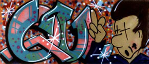
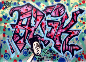
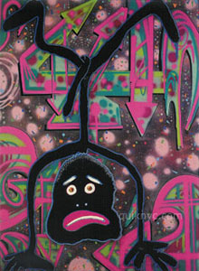
At first sight, the faces that Quik sprays on to paper,
magazines, maps, and other backgrounds appear to be simple
exercises that are consistently repeated. The faces are cartoon-like
shapes in bright colours, with an expressive look communicated
via the eyes or mouth. Sometimes they appear alone, sometimes
in swarms, a mixture of large and small. Closer inspection,
however, shows countless different expressions: pained or
critical as well as exuberantly cheerful and sweet. It is
not unrealistic to think that these faces depict the moods
of the artist, perhaps in combination with other people and
events. The artist himself refers to these faces as ‘souls’.
These powerful faces, which are applied with relentless energy
to the accompaniment of sixties music - especially by Jimi
Hendrix and Neil Young -, summarize much of Quik’s
oeuvre. In addition to the characteristic graffiti technique,
the most powerful ingredients of his work are the expressive
force of the cartoon-like grimaces that directly confront
the viewer, and the underlying message of the artist about
his own feelings in present-day society. To Quik, present-day
society means New York City, his hometown. Even if he signs
his work in Groningen, he still writes ‘NYC’.
What primarily elevates Quik above many other writers is
the consistency that has characterized his imagery and his
message over a period of more than 25 years.
To graffiti writers, the dissemination of their imago (name,
meaning) is of the utmost importance. Right from the outset,
Quik played a leading role in the generation of train graffiti.
Just as in any other new art movement, graffiti evolved due
to the fact that a few individuals began to change their
style, form, composition, and their use of colour and materials.
During this kind of process, the leading lights come into
contact with other forms of artistic expression, and individual
artists subsequently separate from the mainstream. The great
upsurge of graffiti was primarily based on rivalry between
the writers, eloquently articulated as ‘style wars’:
leaving one’s logo at public locations, spreading a
name, getting known, becoming the best. Compact names and
recognizable (cartoon) figures are logical applications that
could impress other train writers as well as the general
public. The writers began to manifest themselves as true
marketing specialists. Like children of the sixties, they
possess an attitude nurtured by Pop Art, kicking against
the traces and all forms of authority, seeking their 15 minutes
of fame. Their train graffiti pieces are inspired by advertisements
on billboards, transferred and multiplied across various
wagons, set in motion by the train, presented to a million-strong
public every day. After their ‘rebel’ period,
many graffiti artists switch to company-commissioned advertising
for clothes, bags, and the design of toys.
Two aspects played a role in the acceptation of graffiti
as a new art movement in the eighties: first of all, the
interest of the art world itself in commercial art-oriented
trends: the inspiration from children’s imagery, resistance
to tedious and intellectual concepts, entertainment. In addition,
the art world also began to develop an interest in fashion
and advertising photography, in video clips with youth idols,
a kind of regeneration of Pop Art by Warhol and his colleagues.
Graffiti first gained renown via photographs by Henry Chalfant
and Martha Cooper, which were soon collected by museums as
a distinctive form of artistic photography, and subsequently
published in books. Warhol and Cooper were intermediaries,
like art critics and gallery owners, who furnished the public
with large editions of quality items in the ‘super & popular’ spirit
of the times (as Frans Haks, one of the first Dutch museum
directors to take an interest in graffiti, referred to this
style). These intermediaries form the second reason why graffiti
became so popular among museums and private collectors. Early
paintings such as I Am the Smoke King, I Am Black (1982),
Lin! (1982), and Thanx Toddo (1982) were acquired for the
collection of the Groninger Museum via these channels. In
stylistic terms, these early works are quite simple in their
structure: large letters with silhouettes, occasionally evolving
into facial forms as in Thanx Toddo, and a cloudy background,
because graffiti writers are not fond of empty surfaces.
Thanx Toddo!, 1982, acryl spray on canvas, 128 x 298 cm, Groninger
Museum
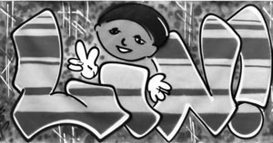
Lin!, 1982, 143 x 280 cm Groninger Museum
|
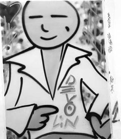 |
Devo, for my loving mom, 1983, 121 x 91,5
cm Groninger Museum |
One of the greatest private intermediaries
in the Netherlands undoubtedly is Henk Pijnenburg, living
in Deurne. His large collection comprises all the stages
of Quik’s
oeuvre. Several fine examples in this collection show how Quik
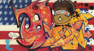
transforms the short messages with a cartoon into an image.
Orange Pink Stripes II (1983) merely shows the name QUIK in
orange and pink stripes, highlighted with stars and spirals.
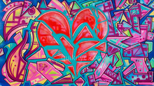
Next, a cartoon face, a heart, a small devil or a doll-like
figure (I’ll never grow old from 1987) start to become
an integral part of the name Quik. The characteristic faces
(souls) pop up in these works as graphic worm-like creatures,
emerging to the foreground in drawings like Dead Souls (1986),
and later becoming the Q of Quik.
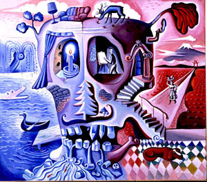
Milan Kunc, Mein Haus, 1984, 209 x 240 cm, Groninger Museum
Apart from Pop Art, Quik also became influenced by his meeting
with the Czech /German painter Milan Kunc in the early 1980’s.
Kunc’s work was also acquired and exhibited in the Groninger
Museum in the mid eighties. Kunc’s imagery is multilayered,
stylistically related to Salvador Dali, whose pictures he often
quotes in his so-called Neo-Surrealistic paintings. He depicts
stereotyped worlds, for example the western world as a blue marsh
(the end of the civilization) opposed to the red Eastern world
as the land of the rising sun, with his own studio in a large
skull in the middle. This work from 1984 is entitled My House.
The giant skull resembles Dali with his characteristic moustache.
Almost every small |
|
| |
|
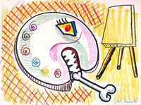 |
image and creature in this painting
is funny and satirical at the same time. Kunc is very concerned
about the decline of the western culture and the violation
of nature. The skullface and the artists palette in the shape
of a face from a 1982- drawing recur in Quik’s souls. |
Milan Kunc, 1982, drawing on paper,
22,8 x 30,4 cm Groninger Museum
|
 |
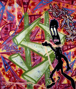
Quik’s work from the
beginning of the nineties displays a baroque, more complicated
style. The letters have become complex compositions in themselves.
The many details in the colours and shapes and the fragmented
surfaces that engender a spatial effect mean that direct legibility
has been sacrificed in favour of a wide range of impressions.
The more abstract a work is, the more it is based on internal
restlessness. An example of this is Wheels
of Confusion, which
dates from 1991 (Groninger Museum).
These baroque works are
a strong outcry of personal emotions. I wish I was blond haired
and blue eyed (1989) in the Pijnenburg collection shows a satirical
self portrait with fragmented hair, eyes, nose and mouth. The
backgrounds, too, are dynamic with many colourful |
expressions
and points. Quik’s development can be clarified by
comparing it to that of his friends Seen (Richard Mirando)
and Blade (Steven Ogburn). Seen and Blade strongly adhere
to the name and the lettering of their original train paintings.
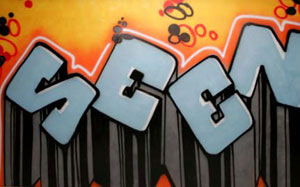
Seen, 1983, 187 x 304 cm, Groninger Museum
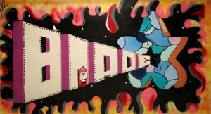
Blade, Come on in, 1983, 179 x 228 cm, Groninger Museum
The letters are occasionally
fragmented or dynamic, like arrowheads against a simple
universe-like background, but they are always robust and
recognizable. Seen is currently oriented toward tattoos – he owns three tattoo shops
in the Bronx and Queens – and also creates reliefs,
three-dimensional graffiti, in which the letter continues
to be the starting point of the image. Although the lettering
also remains an important point of departure for Quik, his
imagery gradually shifted in the course of the nineties toward
a cartoon-like human figure by means of which he attempts
to tell a story. In addition to the faces, this was also
the time in which he began to produce the paintings on the
Playboy centrefolds.
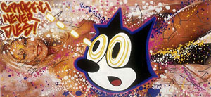
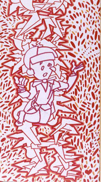
Graffiti never dies!, 1999, 59,7 x 27,8 cm, Groninger Museum
The naked girls often are covered with letters
that are mobile and difficult to decipher, with butterflies
and faces. In this way, Quik improves the ideals of beauty
of the middle-class man. The woman plays a major role in
his themes. Where she has not been painted over or processed,
she appears as a lady with long hair or a beauty queen with
hair stuck up and witprominent breasts, surrounded by glittering
dots. |
 |
Occasionally Quik will add
a personal remark suggesting that he not only questions the
general American Dream but also his own experience or inner
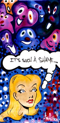
life. It’s such a shame from 1998 shows how emotional
these remarks can be.
It’s such a shame, 1998, 398,5 x 200 cm, Groninger
Museum
|
Another theme reinforces
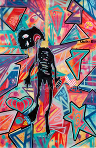
this approach: the emaciated Negro. This figure appears from
1990 onwards. In his studies and drawings, Quik adds more texts
and ideas, thus creating small stories. A party in Pennsylvania
from 1991 (Pijnenburg collection) shows a lynch party. The
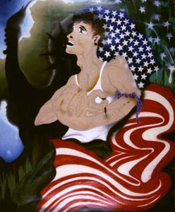
negro is hanging from a bare tree, the American flag next to
him. After his divorce, the artist lived in Pennsylvania for
some time and here he discovered to his disgust, strong Ku
Klux Klan-like tendencies among the population. This negro
figure is easily recognized in the poignant painting Killing
Yourself to Live (1993), donated by Quik to the Groninger Museum
at the farewell reception for Frans Haks. The figure attempts
to hang himself, but the quality of the rope is so poor that
the attempt is unsuccessful. The bitter humour is enhanced
by the cheerful background full of joie de vivre.
Killing Yourself to Live, 1993, acryl
spray on canvas, 185 x 156 cm, Groninger Museum, gift from
the artist
However distinctive it may be, Quik’s cartoon
figure reaches back to the tradition of Sambo, the prototype
of the stupid, inarticulate and lazy ‘nigger boy’,
known in the Netherlands as Sjimmie (in Sjors and Sjimmie)
or Zwarte Piet (Black Pete, St Nicholas’ helper). Although
these figures are often adult, they are treated as children
and also have childish qualities: they are obedient but not
suitable for carrying out difficult jobs. This Sambo stereotype
is used by Afro-American artists such as Michael Ray Charles
from Texas, for example, as a protest against a humiliating
view of the black American. This artist applies the original
Sambo effigy on the billboards in order to convey an extremely
critical message about the ongoing oppression of black people
in the conservative south of the USA – Bush country,
where white people arm themselves to the teeth in fear of
the blacks, encouraged to do so by the weapons industry and
the government. Charles’ paintings are deliberately
primitive and copy the Sambo figure from circus posters,
the game Bamboozled (dealing with double-crossing), and the
tradition of ‘blackface’ (the grease-painted
white actor in films, theatre, and television shows), making
no secret of his unequivocal condemnation. In American society,
the discrimination of the fifties and sixties – the
riots in Montgomery, Alabama (1955, the bus incident with
Rosa Parks), the high school of Little Rock (1957), and eventually
the murder of Martin Luther King (1963) – are still
tangible even today.
|
 |
Michael Ray Charles, (Forever
Free) IF I CAN’T YOU CAN’T, mixed media’ on
wood, 114,9 x 92,7 cm. Henk and Leonie Pijnenburg collection. |
On the surface, Quik’s Negro figure does
not resemble Sambo, but it does in terms of content or intention.
Quik’s critical attitude and imagery can be compared
to the work of the New York / Haitian superstar Jean-Michel
Basquiat and to his fellow writer and co-resident of New York
City: Lee Quinones, who has also been active right from the
start. Lee does not portray the position of the black man but
rather that of another oppressed group, the Latinos, in this
case the Puerto Ricans in New York. They constitute a large
community but are underprivileged, as strikingly depicted by
Lee in his masterpiece Society’s Child, dating from 1982.
Lee Quinones, Society’s Child, 1983,
acryl spray on canvas, 360 x 301 cm, Groninger Museum
The victim is a Puerto Rican junkie with his left arm tied
off, giving himself a shot. The clenched fist protrudes forward
in an eye-catching manner. In the background is the shadow
of the Statue of Liberty, as if it were his own shadow. To
him – just like Quik – this is not the American
Dream but rather the sinister shadow side of society. The
figure is a loser, a symbolic yet simultaneously personal
individual to whom the background gives a universal significance.
Lee’s imagery has developed into dramatic pictures
of crime, war scenes, slums, prostitutes, and junkies, from
which the original name and letters have completely disappeared
to be replaced by figurative, strongly realistic representations.
Only the spray technique still enables his canvases to be
classified as graffiti. Quik, in contrast, adheres more firmly
to the origins of graffiti: the word. He sprays short texts
as a direct emotional comment on the depiction of cartoon-like
shapes: real cartoon figures such as Felix the Cat (in: Graffiti
Never Dies!, 1999) (Groninger Museum, gift of Henk and Leonie
Pijnenburg), or his own creations such as the Beauty Queen
and the faces of the black man. His Negro is not fat or silly
and does not display a big captivating white smile like Sambo
does. Quik’s figure is ground down by American society,
which has disappointed him (only taking instead of giving)
and within which he does not wish to live. Nevertheless,
this society has shaped him and will always remain a part
of him. It is a very personal figure that occasionally reacts
in a very direct way to events in the everyday life of the
artist. It is an alter ego that can be coarse and grotesque,
can attempt to commit suicide, or can teach the viewer something,
in much the same way as the artist himself attempts to teach
something positive to children at black schools in New York,
regardless of how difficult the circumstances may be. From
2000 onwards, the Sambo-type has been transformed into a
tortured black man. Sometimes his eyes and lips are bleeding,
and his ribs, legs and arms look like they have been burned
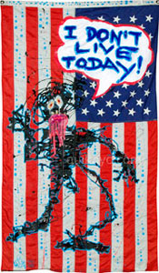
or starved to death. I don’t live today from 2000 in
the Pijnenburg collection has been painted onto an American
flag, literally emphasizing his background. In recent works
from 2004 and 2005, the tormented creature is even stronger
and more desperate, painted in a powerful expressionist style.
It seems that Quik prefers to devote his attention to the
position of the underprivileged rather than to the dissemination
of his own fame (he is sometimes surprised that so many art
connoisseurs value his work so highly). This has also had
a positive influence on his imagery, elevating it far above
the advertising message on the trains. The many faces that
he displays are literally his own faces, and the souls of
all of us.
Steven Kolsteren
Groninger Museum
|
|
|
| |
 |
 |
 |
 |
 |
 |
 |
 |
 |
 |
 |
 |
| Cooper
Photo (1982) |
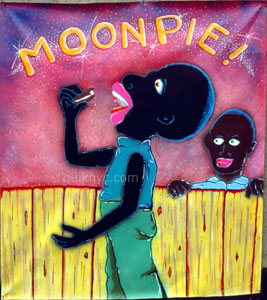
Moonpie
(198x) |
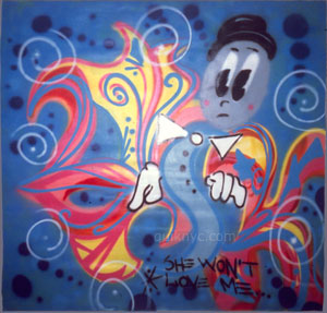
She won’t
love me (198x) |
Crimes
of the heart (1989) |
untitled
(with heart) (1990) |
Birth
of a nation (1991) |
What if
Jasper Johns had been a black man (1990) |
Upside
down (1990) |
I don’t
live today (2000) |
Colour
wheels
of love (2001) |
untitled
(2004) |
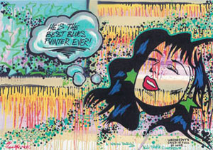
He’s the
best blues painter ever (2004) |
|
|
 |